N-integration output interpretation

Dear All,
first congrats for the great tool you’ve developed.
I’ve undertaken an n-integration analysis of three omics (metabolomics, mrna and mirna) from a series of rat samples with block.spslsda() function in mix omics [also undertaking the tuning with tune.block.spslsa()].
Now I have some questions if possible with regards of the outputs obtained:

  1. As the omics data was already log-transformed, normalised (array wise) and filtered, was I right assigning ‘scale=F’ as parameter for both block.splsa(), perf() and tune.block.splsda() throughout the analysis process?
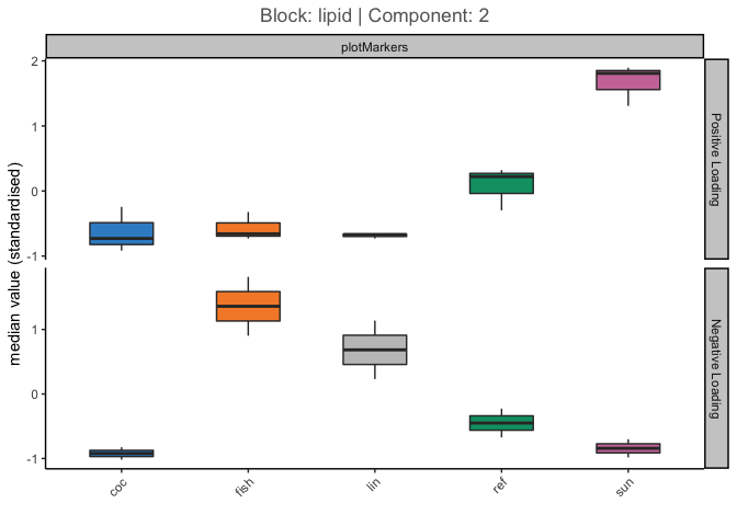
  2. Circos Plot obtained and hereby shown:

    From Gonzalez et al 2012 I could not find a complete answer to how to interpret the 4 group lines (I’ve highlighted them in Red in the screen).
    Are they describing the raw data in terms of different expression between the 4 groups of my Y (4 different brain areas) e.g. meaning that in the red highlighted area the mRNA in the blue group (Cervelletto) are underexpressed with respect of the remnant 3 groups? Plus, are the selected features shown in the circos plot from just the 1st component or from all the component selected as best by block.splsda() (4 components in my case)?
    3)CIN heatmap:

    Are the selected features by tune.block.splsda() shown in the heatmap from the 1st component only or from all the selected components (4 in my case). Plus, in terms of rCC analysis (as it’s not Pearson being the values in the top left scale not restricted between 0-1 right?) and in order to provide a biological interpretation of such plot, how shall I interpret the concept of correlation with respect of a specific feature selected by the algorithm? (e.g. the metabolite/genes selected are up-down correlated with respect to what? The 4 groups (Y) in my case? Or with respect of the samples?).
    Or I should try to recreate the heatmap in Figure 10 of Gonzalez et al 2012 for a better biological interpreation?.

Apologies for the long question and many thanks in advance for the great support.

Best regards

Joosè

Hi @joosefupas,

Thank you for using mixOmics. Please find below the answers to your questions.

If the variables in different blocks widely differ in their variance nature (after all steps you mentioned), it is recommended to put scale=TRUE. Otherwise, scale=FALSE is fine (which I think is the case here given you’ve performed log-transformation). One checkpoint to ensure differences in variance aren’t adversely affecting the model is to set scale=TRUE, near.zero.var=TRUE. The results shouldn’t be wildy different from the case with scale=FALSE.

The lines simply depict the mean of the raw expression levels of the selected variables for samples in different groups.

Exactly

circosPlot takes a comp argument which specifies the components you wish to look at. By default, it uses all the selected variables on all model components. See ?circosPlot

Similarly, the cimDiablo function takes a comp argument where you can select which set of variables (i.e. from which component) to use. See ?cimDiablo

As for the last questions, cimDiablo only depict the values (and nor correlations). We are making some changes to comDiablo and soon there should be a better version available to use :slight_smile:

Hope it helps,

Al

1 Like

Thanks a lot for your reply @aljabadi and happy to realize you are still improving cimDiablo. With regards of the latter function then, what does the Color Key scale (between -2 and 2) indicate? Some sort of differential expression in terms of fold change differences (starting from my previously log-transformed and normalised data in my case) given you indicated that cimDiablo depicts the values and not the correlations? I thought from other posts here in the forum that such Color key scale was component specific (i.e. varying depending on how many comp are selected as argument) in terms of scale but I’ve noticed no changes in such color key scale (i.e. always between -2 and +2) my case plotting different components from the same function.

Thanks a lot again for the great support.

Bests
Joosè

Hi @joosefupas,

I assume by ‘the latter function’ you mean cimDiablo, right? As mentioned before, the depicted values are the the diablo_object$X values (after any possible transformation in block.splsda). The selected variables from all blocks are concatenated and the samples/features are hierarchically clustered (if asked for. See ?cim).

I get different plots for the following. Can you please confirm that is not the case for you? See the output cim1.pngandcim12.png` files after running this code.

data(nutrimouse)
Y = nutrimouse$diet
data = list(gene = nutrimouse$gene, lipid = nutrimouse$lipid)

nutrimouse.sgccda <- block.splsda(X = data,
                                  Y = Y,
                                  design = 'full',
                                  keepX = list(gene = c(10,10), lipid = c(15,15)),
                                  ncomp = 2,
                                  scheme = "centroid")

cimDiablo(nutrimouse.sgccda, save="png", name.save="cim12", comp=1:2)
cimDiablo(nutrimouse.sgccda, save="png", name.save="cim1", comp=1)

Dear @aljabadi,
yes I do have different plots from your code though my initial question was regarding the ‘non-changing’ Color key scale (being always between -2 and 2 regardless the ncomp and data plotted with cimDiablo). Furthermore, I was getting confused after reading the rCC greater than 1 discussion as I wasn’t sure if such Color Key Scale was indicating correlations or not (which it’s now clear it is not).

What I would still like to double check, if possible, it’s the correct interpretation of the cimDiablo results as for my previous question:

@joosefupas
what does the Color Key scale indicate? Some sort of differential expression in terms of fold change differences (starting from my previously log-transformed and normalised data in my case)

For example, taking your nutrimouse dummy example (hereby depicted in the screenshot), how should I interpret the red highlighted blocks (e.g. such selected features were found being ‘overexpressed’ [as their Color Key goes towards 2 i.e. red color in the Color Key Scale] respectively in coc, fish, and lin [rows categories for nutrimouse data] as shown after such features are hierarchically clustered, right?

Thanks a lot again
Joosè

Hi @joosefupas,

That is in fact the artefact of an admittedly imperfect choice that we have made. Since there could be outliers in the multi-block data even after scaling, we trim the values with absolute values greater than 2 for the purpose of cimDiablo. I think we should make it optional, as opposed to hard-coding it. I opened a new issue on this (cimDiablo trims values without any announcements · Issue #136 · mixOmicsTeam/mixOmics · GitHub)

cimDiablo only visualises the (scaled/centred) values for the selected features and performs hierarchical clustering of samples based on these features. The range of the values after such transformations are shown in the colour key. It is up to the us (users) to inspect these values and interpret the dysregulation patterns. Your example is partly correct, however, ‘overexpression’ should not imply differential expression as we have not run such a test. One could say ‘these features tend to have higher expression in classes x and y’, or ‘class x and y are characterised by a higher abundance of such and such features’

Hope it helps,

Al

1 Like

Hi @joosefupas,

We’ve added a new function to visualise the markers for block analyses. You can install the latest github version to try it using the following code:

data(nutrimouse)
Y = nutrimouse$diet
data = list(gene = nutrimouse$gene, lipid = nutrimouse$lipid)

nutrimouse.sgccda <- block.splsda(X = data,
                                  Y = Y,
                                  design = 'full',
                                  keepX = list(gene = c(10,10), lipid = c(15,15)),
                                  ncomp = 2,
                                  scheme = "centroid")

top_markers <- selectVar(nutrimouse.sgccda)$lipid$name[1:5]
plotMarkers(nutrimouse.sgccda, block = 'lipid', comp = 1, markers = top_markers)

# aggregate all features and separate by loadings signs
plotMarkers(nutrimouse.sgccda, block = 'lipid', comp = 1, global = TRUE)

Created on 2021-07-16 by the reprex package (v2.0.0)

1 Like

Dear @aljabadi,
thanks a lot for the great implementation, the plots look great! Just want to make sure I’ve got the interpretation right:

  • Could not find a scale = T/F argument in the plotMarkers() function hence I guess the y axis [value (standardised)] it’s taking for granted that expression values will be standardised at this stage, right?
  • First Plot (Block Lipid|Component: 1): it’s right to interpret that selected feature C16.1n.7 was found to be ‘overexpressed’ (of course differently from the LIMMA concept) in coc group with respect of the other remnant groups;
  • Second Plot (Block: lipid | Component: 1): it’s right to interpret that, the selected features of ref (green) group, as an aggregate, were mostly underexpressed (i.e. violin plot being more pronunced towards the negative loading side) and that coc expression (blue group) values were the most over and underexpressed with respect of the other groups?

Thanks a lot again for the great support.

Bests

Joosè

Hi @joosefupas,

You’re welcome!

Thank you for pointing this out. It should actually not mention ‘standardised’ if scale=FALSE. I just fixed that to push. In the meantime, if you use scale=FALSE feel free to do:

p <- plotMarkers(nutrimouse.sgccda, block = 'lipid', comp = 1, markers = top_markers) +
       labs(y = 'value')
p

Exactly. In this case it is apparent that it should be ‘overexpressed’ even in the statistical sense :slight_smile:

The global plot, arguably, is not always as informative. The model should be really tuned for it to make clear sense, otherwise the untuned variables could weaken the signal. Please find below a thought process of how to use plotMarkers in combination with the sample plots.

data(nutrimouse)
Y = nutrimouse$diet
data = list(gene = nutrimouse$gene, lipid = nutrimouse$lipid)

nutrimouse.sgccda <- block.splsda(X = data,
                                  Y = Y,
                                  design = 'full',
                                  keepX = list(gene = c(4,4), lipid = c(5,5)),
                                  ncomp = 4,
                                  scale=TRUE,
                                  scheme = "centroid")

plotIndiv(nutrimouse.sgccda, comp = c(1,2), legend = TRUE, blocks = 'lipid')

# the first comp is separating 'coc' from the rest, while
# the second comp is separating 'sun' from the rest
# now let's look at the median expression (global=TRUE) of features for these two:
# comp1  -- 'coc' from the rest. we can see that markers with all markers have -ve loadings - driving this separation:
plotMarkers(nutrimouse.sgccda, block = 'lipid', comp = 1, global = TRUE)

# comp2  -- 'sun' (and 'ref') rom the rest
# we can see that markers with both +ve and -ve loadings are driving these separations
plotMarkers(nutrimouse.sgccda, block = 'lipid', comp = 2, global = TRUE, violin = FALSE)

plotIndiv(nutrimouse.sgccda, comp = c(2,3), legend = TRUE, blocks = 'lipid')

# the third one doesn't separate specific groups distinctly
# possibly capturing some unwanted variation
# let's look at the markers
plotMarkers(nutrimouse.sgccda, block = 'lipid', comp = 3, global = TRUE)

# the fourth comp is separating 'lin' from others
plotIndiv(nutrimouse.sgccda, comp = c(2,4), legend = TRUE, blocks = 'lipid')

# but we don't see that at global level
plotMarkers(nutrimouse.sgccda, block = 'lipid', comp = 4, global = TRUE)

# that is because there's only few variables driving this separation:
top_markers <- selectVar(nutrimouse.sgccda, comp=4)$lipid$name[1:5]
plotMarkers(nutrimouse.sgccda, block = 'lipid', comp = 4, global = FALSE, violin = FALSE, markers = top_markers)

# most of the signal is in fact coming from the first 3 (or 4).

Created on 2021-07-19 by the reprex package (v2.0.0)

Hope it helps,

Al

1 Like

Dear @aljabadi,
wonderful explanation, much appreciated and I will implement it straight away in my n-integration analysis!

Bests

Giuseppe

Hi @joosefupas,

You’re welcome. I just pushed some (major) fixes and changes to this function and update the code examples above. Please install the latest GitHub package and go through the examples above again.

Kind regards

Al